Loading
Homepage
  • Client:  Primo Education
  • Branding

Burger Dojo

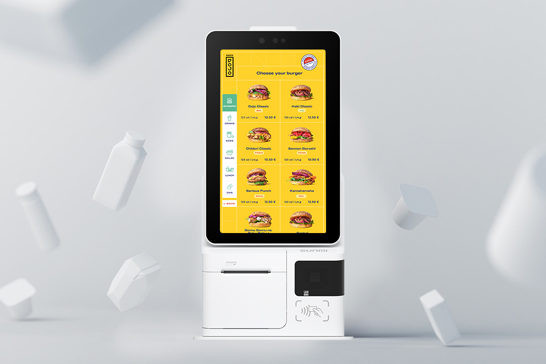
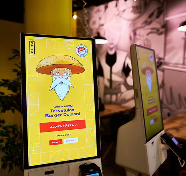
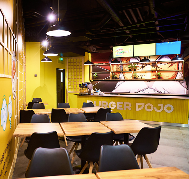
Burger Dojo, a popular fast-food chain, aims to create a unique, energetic, and fun dining experience. heir brand guidelines emphasize: 

    • Color Palette: Primarily bold reds and vibrant yellows, with accents of black and white.
    • Typography: A modern, sans-serif font,Adieu
    • Branding Elements: A stylized dojo symbol, incorporating martial arts elements, and a playful mascot.

Challenges

Burger Dojo's kiosk faced challenges in accommodating the needs of older customers, while the kitchen app struggled with synchronization and navigation, particularly for staff wearing gloves.

Solution

  1. Enhance kiosk accessibility:
    • Larger fonts and icons: Make text and images easier to read and understand.
    • Simplified interface: Reduce the number of steps required to complete an order.
  2. Optimize kitchen app usability:
    • Touchscreen-friendly design: Ensure buttons and controls are large enough for gloved fingers.
    • Real-time order updates: Display order status changes immediately on the queue screen.
    • Intuitive navigation: Big order cards and clear labels with a logical layout to guide kitchen staff.

Similar projects

Ready to bring your ideas to life? I'm here to help

© Manojthapa 2024. All rights reserved.